 | ||||||
| GF Smith Logo |
GF Smith aim to please people in the graphics and printing industries by promoting paper for business cares, letterheads, folders, promotional brochures, report and accounts, greetings cards and packaging. Basically they produce paper for anything there is a need of.
GF Smith created a colorplan which contains 56 different colours, 8 weights and 25 embossings, which can be used for boards or paper of many sizes suitable for the consumers needs. Along with envolopes to match.
Colorlux is a film laminate development of colorplan which gives a two sided metalic finish in either matt or gloss to the colour chosen from the colorplan. Not only does this give a fantastic effect but it keeps up to environmental standards of being biodegradable and compostable. GF Smith papers is fully aware of current trends and they play a big part in protecting the environment. To do this they use renewable energy sources where possible, raise environmental awareness to their employees, invest in new machinery to aid reduction of wastage and energy consumption, limit the use of non biodegradable chemicals where possible, recycle when they can and many more.
I am now going to look into existing Paper Sculpture designers and see which inspire me the most.
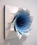
Peter Callesen
Peter Callesen uses paper to create sculptures just like Richard Sweeney, however Paper Callesen takes a totally different approach.
There are many of his pieces which are my favourites but i chose to show these few images because they either relate to natural forms or a human form/nature. This is relevant in this project and may well influence my final outcome once i have experimented to see if i can give the same effect using the techniques Peter uses.
Here is some examples of his work.

This first image is so amazing because of the fine detail which is present on the 3D sculpture in the middle of the paper.


To evaluate Peters work he says,
''The paper cut sculptures explore the probable and magical transformation of the flat sheet of paper into figures that expand into the space surrounding them. The negative and absent 2 dimensional space left by the cut, points out the contrast to the 3 dimensional reality it creates, even though the figures still stick to their origin without the possibility of escaping. In that sense there is also an aspect of something tragic in many of the cuts.''
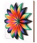
Jen Stark
Jen Stark is also a contemporary artist who creates paper sculptures. Her work is inspired by microscopic patterns in nature, wormholes and sliced anatomy and then she bases them on replication and infinity, echoing patterns and intelligent designs found in nature.
Here are a few examples of her work:

I can't really explain this piece because it simply looks like a hole/ tunnel getting deeper and deeper with a light at the end of it. This could be representing a wormhole. Im not sure why Jen Stark has used colour on this piece or maybe she is trying to contrast the fact that wormholes are very dull and not interesting.

I love this piece of work and i feel that it is one of the more relevant pieces to my work. I think the use of one colour works really well and the change in shades which almost shows a colour chart of that particular colour. This gives depth to the flower form and it looks like Jen wanted to highlight the middle part of the flower by letting the colour gradually go to white. The fact that each flower is made of one colour, but put together with 2 other coloured flowers to form a 'set' which makes them belong.

After looking at Jen Spark's work it has encouraged me to introduce colour into my work. I think it would contribute well and considering i will be producing a poster on GF Smith paper which does sell 56 colour shades it would be appropriate.
Julene Harrison
Julene Harrison is a British designer and illustrator and she can make hand cut paper artwork. She focuses on making hand made cards or papers and personalises them with paper cut out typography. She is completely different to the Richard Sweeney, Peter Callesen and Jen Stark. I found her work very interesting because i was a bit confused on how to create text out of paper, therefore she has been useful to look at for inspiration. I researched her and the more i looked at her work the more i liked it, i think it is amazing. She uses a lot of illustration and typography in her pieces and it looks fantastic.
Here are some examples of her work:


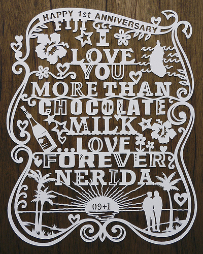

I really enjoyed looking at Julene's work and i will definitely refer to it in my work and i will take her techniques and they could be very helpful when adding the text to my poster.
All of these designers will definitely inspire me in some way, to carry my work forward.


I am now moving on to look at technical elements which can potentially inspire my poster design layout.

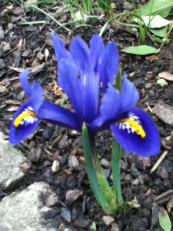
Here are some images of natural form which will inspire my work. Flowers, shells and feathers, both primary and secondary research:


Out of everything i researched i found flowers the most interesting. Maybe this is because of the colour elements but also maybe because it is always nice on a summers day to see pretty flowers, they make everybody smile and feel better.


I found researching shells quite interesting but not as interesting as flowers. I think some shells are very detailed and inspiring and i think they would be rather easy to make out of paper. I will experiment with this and see what the outcome is.


Feathers do interest me and the background of where they come from can be interesting too. I will research further into the background of them and see if i can be inspired from it and it may possibly help me with the production of making feathers out of paper because off the top of my head i can't think of many ways to make a sculpture of a feather.
I am now moving on to look at technical elements which can potentially inspire my poster design layout.
Fibonacci Spiral.
The finonacci spiral, can sometimes be known as the golden spiral, these aren't entirely the same but very close. A golden spiral can be approximated by a 'whirling rectangle diagram' in which the opposite corners or squares formed by spiralling golden rectangles are connected by quarter-circles. This result is very similar to a true golden spiral.
Here is the fibonacci spiral:
Here is the fibonacci spiral:
