I produced a different paper sculpture to celebrate 100 years of GF Smith paper because i wanted it to be completely relevant to GF Smith and the way in which they operate and what they have to offer. Here are photographs of the sculpture i will use for my poster:


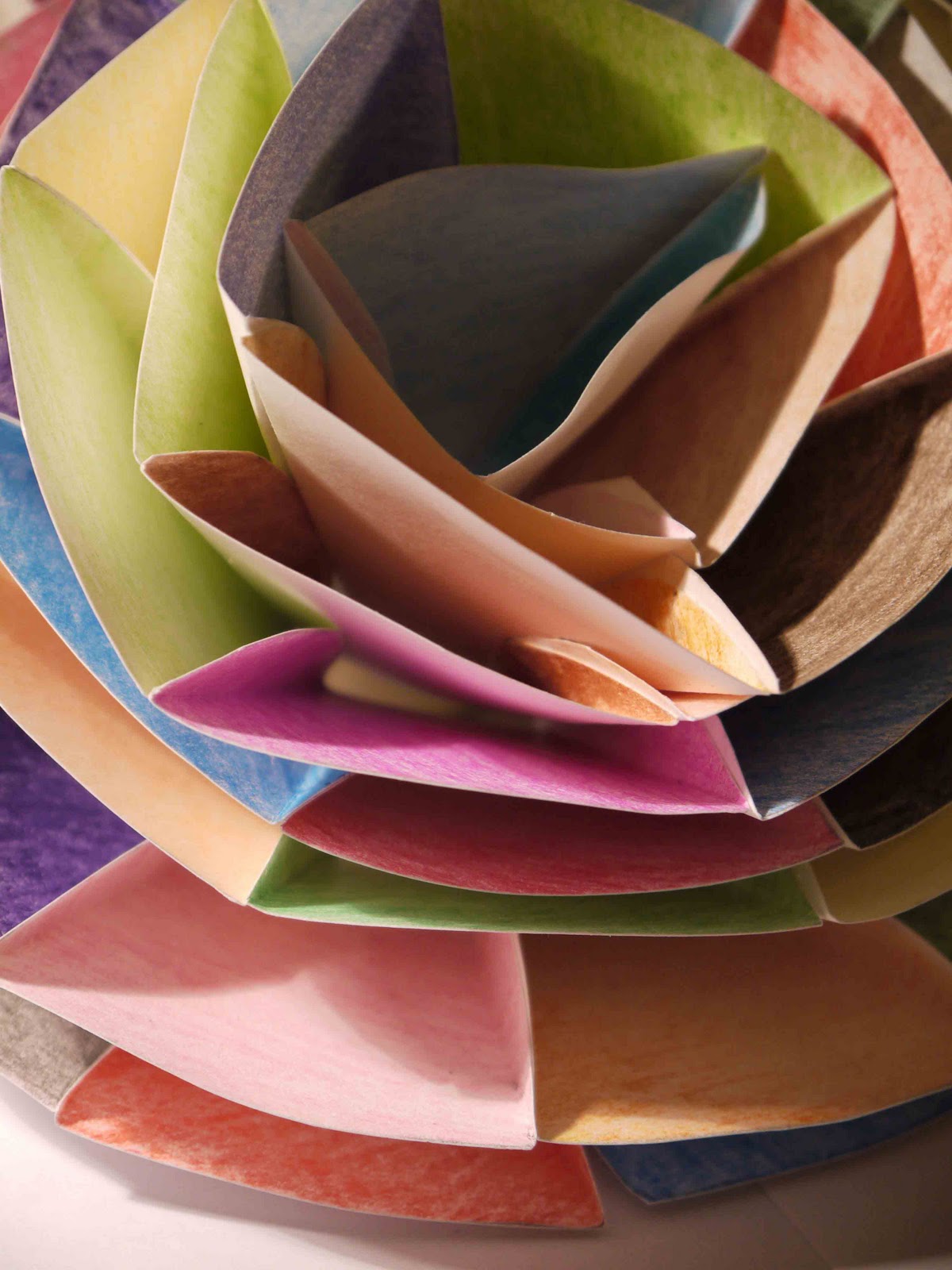


My sculpture for my poster was very successful and it is made up of 56 repeated sections, all which are different colours. The reason behind this is because GF Smith sell paper in 56 different colours/shade. I thought this was appropriate and i am very impressed with the outcome. I chose to produce a flower because GF Smith are as environmentally friendly as they can possibly be, therefore they aren't killing the environment, they are keeping it a 'green' healthy place.
Here are a few poster designs i produced, using my final paper sculpture.


Here is a poster i produced on photo shop by putting the big image in the background and adding writing over the top. This was one of the best layouts i decided on because it compliments the image/sculpture and advertises GF Smith paper very well. Out of these 2 designs i prefer the one to the right. However much i like the image in the background i think it looks better slightly faded because it helps clearly see the writing. I also think the design to the right looks more professional and attractive on the eye. If i was walking past these 2 posters, i would certainly stop and look at the right because the one on the left is too harsh and even though it has brighter colours i don't think it attracts the viewer for the correct reasons.


With what i have learnt previously i put the image as the whole of the background. These 2 poster designs were both very successful. I think both the black and white design and the colour design compliment the type and both look professional. However, considering the background of GF Smith and what i am trying to advertise to the viewer, it would be best in colour because it shows the 56 different colours they sell and it is clearer that the sculpture in the background is made from paper. I will take this into consideration when producing my next design.
My next design is my final poster design. I have taken everything into consideration during my development and experimentation and here is my outcome:

There is more information and explanation about my final poster design on the page 'final poster and sculpture'.